Adventures migrating from HTMLDB 1.6 to Theme 25 p2
This is Part 2 in the series, checked out Part 1 if you missed it.
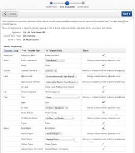
First order of business, make a copy of the public pages application. Install Theme 25 and make it current. Cool! So far so good, the Verify Compatibility step didn’t have any issues we couldn’t resolve.
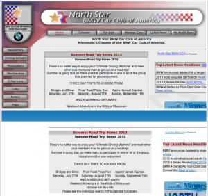
But the joy didn’t last long. As expected, the home page wasn’t that big of a shocker since most of the look & feel AND navigation was hardcoded in the template. (Editor’s note: Kids, this is why you don’t want to hardcode your navigation in the template.)
But the rest of the pages were just plain scary. Lets look at the Calendar (p4) and Event Details page (p5)
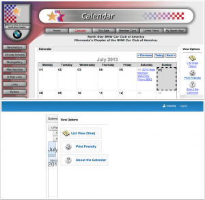
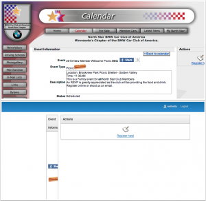
Yeah, it was bad
Oh boy, I had my work cut out. But perhaps, it was not all completely terrible. Perhaps, the correct page template needed to be selected and regions moved to the correct template position.
I settled on pages with tabs and right sidebar (most of the time at least). So you’ll want to set that up in your Theme Defaults (Shared Components -> Themes -> Click on a theme, but make sure you’re on the Report View).


I tested the pages and there was absolutely no change. That’s because quite a few pages had the Template specified in the page details. This setting will override the default. For consistency, it’s best to set your page template to “Use Theme Default”. Then, only change it on a page by page basis when you need to.
The Grid
Ok, the Event Detail page is still looking terrible. You’ve probably seen something like this before. The reason lies in the big difference between how table layout for regions was handled before APEX 4.2 and how The Grid affects region layout now.
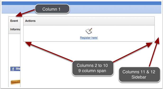
This page had two standard regions before. One in Column 1 (Event Information), the other (Actions) in Column 2. This got carried over to The Grid as Column 1 and Column 2 respectively, but it really didn’t get translated. There’s also a new element available to us now and that’s the Column Span, which was simply left as Automatic.
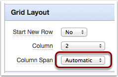
What APEX ends up doing, while processing things for “The Grid”, is see that the first region says Column 1 and Column Span is Automatic, so it says “I need to see what the next region wants”. The second Region (Actions) wants Column 2. This means it needs to start on Column 2. That means that Region 1 cannot span any columns and it must be set to a width of ONE COLUMN. We’ll get into The Grid in a moment but, for now, take note that The Grid for this template has 12 columns. No more, no less. Now it’s time to render Region 2 (Actions), this one starts on Column 2, the Column Span is set to Automatic and there are no other regions following. The only other limitation is the Right Sidebar, which is defined as 2 columns. That makes Region 2 span 9 columns. Which effectively explains our weird layout.
In this inspect image we can see the same thing, but now with the corresponding HTML and classes.
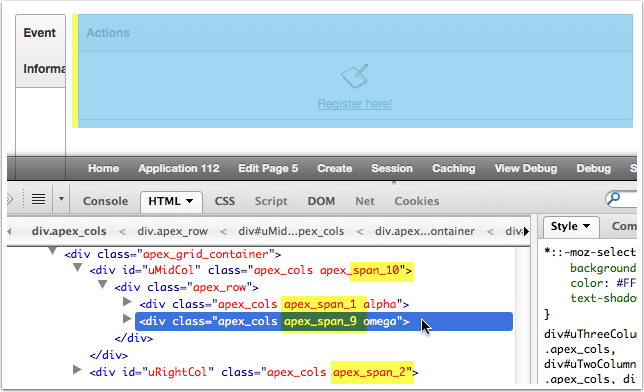
Notice the div id=”uMidCol”, this is our content region. It’s defined with a span of 10 columns (apex_span_10). Then there’s the right sidebar (div#uRightCol) set to a span of 2 columns (apex_span_2). Together we have the 12 columns available to our layout.
Within the uMidCol, we can see our Event Information div which gets a apex_span_1, effectively making it the width of ONE column only. The highlighted second region (Actions) get a class of apex_span_9. The alpha and omega classes (first and last letters of the Greek Alphabet) are used to define beginning and end of a grid layout.
How do we fix this? We have several permutations and more than one may yield acceptable results.
Option 1. Change everything to Automatic: Column = Automatic and Column Span = Automatic
Option 2. Chose the number of columns you want to use for each of the regions. Knowing that you have 12 columns, set your spans manually to size things as you wish. This is one of the benefits of using a Grid system.
Option 3. If you use a template with a sidebar, move the small region to the sidebar template position (The right sidebar is #REGION_POSITION_03#), keep your main region in the body and set the Column and Column Span to Automatic.
I settled with Option 2 for now, but Option 3 would have worked well for this layout also.
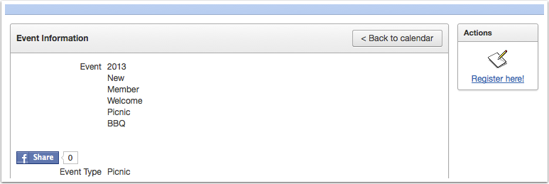
Region 2: Column = Automatic, Colspan = Automatic (because it will take the remaining 2 columns)
The same type of fix was required for just about all the other pages. Now, as you can see, the regions are looking a lot better. On the next installment, we’ll talk about why the items are all squeezed into a tight column.


I love comments, write me a line