Building a menu drawer in your APEX desktop app
 In this blog post I’ll go through the steps I followed to build a mobile style “menu drawer”, like the animation you see here, but for your desktop application.
This UI element is not something I would consider for a lot of applications. However, I do think it has it’s place. I think it’s valuable when you want to maximize your horizontal available space. Or when there’s a different way of organizing the information that’s already on the screen. For example, I once used it to display a tree view of the attributes represented on the page. The tree view only organized information already on the screen in a hierarchical manner. It didn’t really contain anything new, therefore it made sense to hide it away. Another use would be as navigation tool, perhaps even a context sensitive navigation. It’s up to you. I’m sure you’ll find some interesting uses, please share them in the comments below.
Identify the sidebar
We want to use a Left Sidebar Page Template, but since every Page Template is different, we need to identify the tag elements that make up the sidebar. I’m using “Theme 26” for this blog post, but this technique will work on all themes, albeit with some adjustments. The code provided will also work with “Theme 25”, however the current code is not responsive aware. The sidebar will show above the main content. I think a future blog post could provide the necessary changes for the drawer to work on a small screen or mobile device.
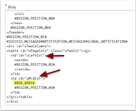
First I open my Page Template. Within the “Body” section, I look for the Box Body substitution string (#BOX_BODY#). I see that it’s placed within the uMidCol table call (td) element. Then, we can find the sidebar section which is under the uLeftCol id. This sidebar section will become our sliding drawer. We’ll want to remember that and remember that everything within it is also wrapped in the “aside” tags. We identify that #REGION_POSITION_02# is the location for content in the sidebar.
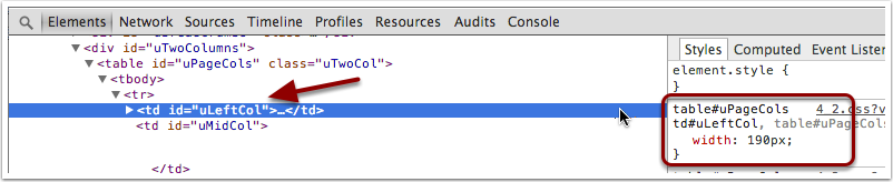
Next I run the page and find uLeftCol sidebar, by using the inspector. We want to find the width. I see that the default width is 190px. Also interesting is identifying the selector “table#uPageCols td#uLeftCol” because we’re going to override it when we close the slider.
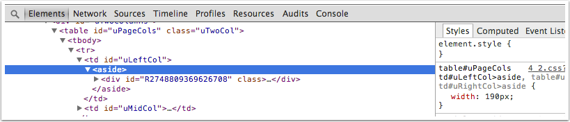
However, I also know that the “aside” tag also has a 190px. This can be tricky, without this information our sidebar may not close correctly because the aside tag would remain at 190px wide.
The Drawer Handle
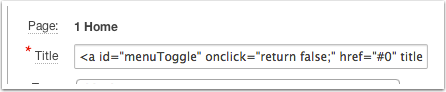
Now for the drawer! We need a “handle” to click on to open and close the sidebar. We’re going to add the following code to region title.
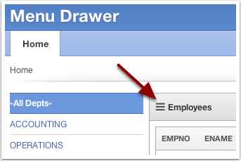
<a id="menuToggle" onclick="return false;" href="#0" title="Hide or Show Menu">☰</a> Employees
 #menuToggle will be our jQuery selector on a Dynamic Action to be able to trigger the open and close of the trigger.
The title will show a tooltip when we hover over it. The funky ☰ is a 3 bar character, which has now become the universal symbol for a menu.
We also need some styling on it. We’ll make it bigger, dark color, and remove the underline link.
#menuToggle {
color: #555;
text-decoration: none;
font-size: 1.3em;
}
Lets get moving!
Now let’s use this new menuToggle as the action on a Dynamic Action. We’ll call the Dynamic Action “Toggle Menu Drawer”. The Event: Click and jQuery Selector with #menuToggle
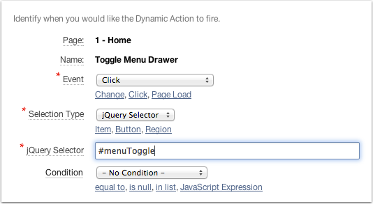
The Action will be “Execute JavaScript Code”, and make sure it does NOT Fire On Page Load. This is out code:
$("#uLeftCol,#uLeftCol aside").animate({width: 0},
 function (){
   $("#uLeftCol").addClass("close");
 }
);
As of this moment, we can actually close our side bar! Try it out. But lets take it to the next level and make it open and close.
Putting it all together
Lets use our menuToggle element to hold the state of the drawer via a class. We’ll add the class “open” when the drawer is open and switch it to “closed” when it closes.
Here’s our new code:
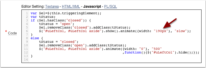
var $el=$(this.triggeringElement);
var tStatus;
if ($el.hasClass("closed")) {
  tStatus = "open";
  $el.removeClass("closed").addClass(tStatus);
  $("#uLeftCol, #uLeftCol aside").show().animate({width: "190px"}, "slow");
}
else {
  tStatus = "closed";
  $el.removeClass("open").addClass(tStatus);
  $("#uLeftCol, #uLeftCol aside").animate({width: "0"}, "500"
                ,function(){
                   $("#uLeftCol").hide();
                 });
}
Lets walk through it. If the menuToggle has a class of “closed”, meaning it’s already closed, then we want to slide the drawer open. We remove the “closed” class and add a new “open” class. This is how the page will remember the current state. Then we use animate to change the width of both the #uLeftCol and #uLeftCol aside back to 190px. This is our hardcoded width for the sidebar. Animate will incrementally change the width from zero back to 190px, giving us a nice sliding open animation.
For the “else” portion, we will be closing the sidebar. We remove the “open” class and add “closed” instead. Then we animate both #uLeftCol and #uLeftCol aside to a width of zero, at a speed of 500 ms. The callback function is needed because once the widths are zero, we also hide the #uLeftCol. If we didn’t use a callback this hide would happen at the same time as the animate and thus we would miss out on the sliding effect. Oh and in case you’re wondering, the hide() call is needed because the content inside the sidebar may bleed out.
Remember we don’t want the Javascript to Fire On Page Load? What would happen if it does? The drawer will close as soon as the page loads because that’s the condition we have on our page. You may want that. I’ve also reversed the if-then-else so the menu opens when the page loads, but instead of the default 190px, I use a different value (usually larger). Then as soon as the page loads, the sidebar will grow. Then as you click the toggle, it will close and open as expected.
Here’s is a link to the demo app. If you want to download and install the app, here’s the app export also.


Hi, I'm Jorge Rimblas. Father, husband, photographer, Oraclenerd, Oracle APEX expert, Oracle ACE, coffee lover, car guy, gadget addict, etc... I'm an APEX Tech Lead DRW. I have worked with Oracle since 1995 and done eBusiness Suite implementations and customizations. Nowadays I specialize almost exclusively in Oracle APEX.
Hello Guru,
I was reading your comments on http://www.eberapp.com/pls/apex/f?p=BLOG:READ:0::::ARTICLE:3967500346242847 and i came across your comments how to achieve same using apex_util.get_preference(‘TREE_STATUS’) is there any working example or demo to check it out?
Thanks
Sure, thanks for asking. My next blog post has the instructions and the finished demo. Here’s the link http://rimblas.com/blog/2014/04/enhancing-the-menu-drawer-using-preferences/
Thanks.
I am really looking for a use case to save the sate of hide and show region.
Well it would depend for what purpose you use the hidden region. I think mostly you’ll want to remember the state if it would enhance the user experience to return to the page and find the region the way they left it.
Yes exactly.
Sorry I should have mentioned as a demo page rather than a use case, basically i am looking for sample demo page which does it.
https://apex.oracle.com/pls/apex/f?p=83524:10:
I want similar to what this url http://www.eberapp.com/pls/apex/f?p=BLOG:READ:0 does but with your approach.In the mentioned url how to capture the state when user click hide and show button and then set it back on page load .
Great job! :-)
It looks even nicer when you add the following CSS
ul.uVerticalSidebarList
{
white-space: nowrap;
}
because it avoids line-breaking when reducing the width of the sidebar.
Thank you! Very good suggestion too.