A wireframe is worth a 1000 words
I better get this out of the way. I love Balsamiq Mockups! There, I said it. This post will probably sound like an advertisement, but it’s not. It’s unsolicited and I paid for my own version of Balsamiq. However, for the money (measly $79 for the desktop version) it’s the best tool I know for the job. What is the job you ask? Well, to create wireframes or mockups for your applications. I do know a lot of people that are Balsamiq users already, if you’re one of them, you’re probably not going to learn that much here.
I use Balsamiq all the time for my APEX projects. It’s simple, quick, and easy. It allows me to communicate in a graphical format how I expect an application will look. If the system I’m building is not all that well defined, I always tell my clients “even if my first draft (of the mockups) is wrong, at least we’ll have something to discuss and that will be progress”.
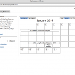
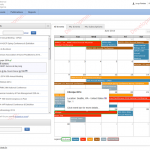
Here’s an example of a mockup page created with Balsamiq and the APEX application equivalent.


Of course, they are not identical, but the end result was awful close if we concentrate on layout and functionality. Balsamiq is meant to have a low-fidelity (Lo-Fi) look. This means that it is not meant to be pixel perfect or represent a real app. It even has a hand drawn look to it. It allows people to focus on features, functionality and layout. I especially like that people will not get distracted by the font you used or the color of the buttons. That all becomes secondary. Also, I have found that you, as a developer and architect of the system, and the users get aligned with the objectives of the system a lot better.
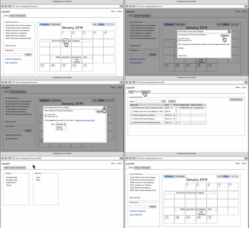
When it comes time to sharing the mockups, Balsamiq allows you to export each page as and individual PNG image. However, where it really shines is exporting a PDF that the users can navigate as if they were using some sort of skeleton version of the application. If you have a button link to another page, the PDF will link the two together. In fact, most UI elements in Balsamiq can link to other pages. Here’s a small animation showing what I mean. As you click around you navigate the PDF. Notice how you can navigate the tabs of your application.

Balsamiq comes with many UI and layout controls out of the box: labels, text fields, datepicker fields, text areas, radio buttons, checkboxes, select/dropdowns, lists, many icons, field sets (which I use as regions), Data Grids (perfect for Classic or IR reports), Tabs, and many, many more. Just about everything you’ll need to create very convincing mockups of your applications. Once they are built, it’s easier for me to split a project among different developers. We all get to work from a clearly defined blueprint.
Limitations
I would be remiss if I didn’t mention some of the downsides and limitations. First of all, with the mockups, you are representing the UI of the application, you’re not representing business logic. For example, if a button massages and transforms lots of data, Balsamiq will not help you in describing this data transformation (unless you use it to create a workflow diagram, which you can). It’s also hard to represent how some sections will hide and show based on some user action. To accomplish something like that you need to create a copy of the page and make the necessary edits. This brings me to another downside. You often duplicate a page and make edits to represent a new state or have a new version (this is very common when representing modal windows). Sometimes you even duplicate this new edit/version and make even more edits. The problem comes when you need to go back to the original to make some change. Then your duplicates, which are now new pages based on the original, will not reflect these new changes. Balsamiq does offer what it calls “Symbols” to help will this. For example, unless I’m 100% sure my tabs won’t change, I will place my browser window element, tabs and navigation bars on it’s own symbol. The symbol is then used on all the pages I create. If the symbol changes, the other pages will immediately reflect this change. It’s sort of using file “includes”.
If you have several roles or rights in your application, you’re probably going to want to create a mockup for the most privileged user. That way you show all the possible elements and available functionality. Sometimes, however, you may need to create a brand new mockup to represent some other role/right, but I find it that this is rarely the case.
Bottom Line
Some people will probably think that building with APEX is already pretty fast and that you can do your mockups directly with APEX. I find that works fine for simple applications or when the end result is pretty clear to all involved. But, if I’m building something more complex than a breadbox, mockups are ideal.
Creating wireframes allows me to better plan my design. It makes development and communication with the end users and stakeholders a lot easier. People rarely get disappointed when they see the real application, quite the opposite, the more you include them in the wireframe building process the more ownership they take. It makes my life a lot easier. Even if you don’t use Balsamiq, I would recommend you use something to wireframe your applications. I’m sure you’ll be happy you did.


I love comments, write me a line