Single Item CSS Grid Alignment
I often need to have a single item on a page (think a search item above a report for example). I would like this item’s label to still align to the right, but be flush with the left side of the report. Like so:
However, with the current CSS grid implementation of the Universal Theme, this type of layout is not possible in a declarative way. Depending on the screen size, you always end up with some extra space.
Here’s a little bit of CSS that I find myself using a lot. If your item is called P310_SEARCH you will want to add the _CONTAIER suffix:
#P310_SEARCH_CONTAINER .t-Form-labelContainer {
 width: auto;
}
It basically finds the div for the label and changes the with to whatever the grid wants (a fixed percent) to automatic. By making it automatic, the width will now be the length of the label.
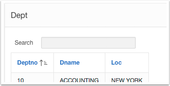
Here’s the end result with the CSS
and without the extra CSS:


Hi, I'm Jorge Rimblas. Father, husband, photographer, Oraclenerd, Oracle APEX expert, Oracle ACE, coffee lover, car guy, gadget addict, etc... I'm an APEX Tech Lead DRW. I have worked with Oracle since 1995 and done eBusiness Suite implementations and customizations. Nowadays I specialize almost exclusively in Oracle APEX.
Nice quick tip. I’ve started using it.
I used a more generic CSS approach thought.
.width–noGrid .col.t-Form-labelContainer {
width: auto;
}
Then under the Layout CSS class, I use “width–noGrid”
I like it, very nice approach.
Could we set it up as a Template Option? I think even with that approach, the Layout CSS field position is not something we can manipulate with a Template Option. Did you try?